Name: CHIN TZE WEI
Assignment 01
"Visual Design"
Assignment Brief
Students will acquire visual communication thinking skills through sketching, digitizing, and applying the design techniques and knowledge to relevant collaterals. Each student is to produce original ideas of their own visual design with the introduction of graphic design application and technical digitization skills.
Logo Design Requirements:
-
Logo dimension: 1000px x 1000px
-
Direction of logo: CORPORATE & MINIMAL.
-
Logo type: Logo MARK ONLY.
-
Students are to propose THREE (3) keywords that reflect the essence of the FOUNDATION IN DESIGN program, which will be the driving force and the slogan of the logo.
-
Colour palette should be of ONE out of the THREE palettes given.
Submission Requirement
Students are required to produce TWO (2) printed A3 presentation mounting boards in landscape orientation (placed vertically on the board) which include :
-
Design Process Board
- 9 sketches of logo proposal
- 3 proposed keywords that will be the slogan of the logo
- 3 nos of colour palette proposal
- Descriptions of the meaning behind logo design -
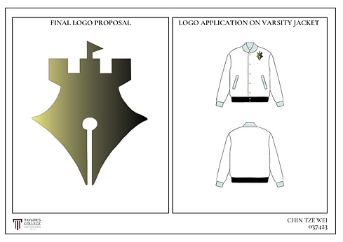
Final Logo Proposal
- Final logo design
- Logo application (On a varsity jacket)
Learning Objectives
-
Introduce and equip students with the ability to critically evaluate and conceptualize logo
-
design based on purpose, design, and usability.
-
Develop an understanding and identify the major criteria that experts use to evaluate logo design and apply those criteria to your own evaluations.
-
Demonstrate the use of expressive communication skills in logo design and digitization.
Learning Outcome
Upon successful completion of these exercises, students will be able to demonstrate and apply knowledge of design principles, technical processes, tools, and software.
TGC Aqquired
-
TGC 1 (Discipline Specific Knowledge)
- TGC 1.2 : Undersatnd ethical issues in the context of the field of study


My Ideas
At the beginning of designing this logo, all the thoughts in my head revolved around, school, pen, and wrench. So naturally, the image is all about them. As for why these three elements, it's because I think the foundation symbolizes a good base for us to absorb the skills we need before we go out to work in the community, and the school is the one that provides these skills, so element one, the school, came up. Then, because we study design, we need to draw many, many sketches before a finished product is designed, and all we need to draw these sketches is a pen, so element two, the pen, came out. As for why it's a wrench, it's because a long time ago I heard someone say something that I still agree with. He said, "Design is about solving problems." So the wrench is an item that I think is more relevant, it represents more than just a wrench, it represents problem solving. Element three, the wrench, came out like that.
My Process
Before starting on the design progress, I have read the assignment brief, this is so that I don't make it halfway through before I realize I was doing it wrong.
After that, I start to think about the 3 keywords that can represent the whole Taylor's Design School, this is because this logo mean a lot to Taylor's Design School, it represent the whole design school.
The 3 keywords that cames up to my mind is base, create and solve.
After the keywords, I starts to create some sketches base on the keywords itself. There's how these 9 sketches came out.
Moreover, I start to use the software, which is Adobe Illustration to try to make one of my final logo that I've decided, which are the 2nd, 4th and 6th design sketch lists above.
Furthermore, I show the sketches to Mr Faez which is my tutor. He gives me feedbacks that he like the 6th design sketches the most, so I followed his feedback and tried my best to improve the 6th design sketch. The colour remain unchanged and I added some gradient into the design, and the outcome is what y'all seeing right now at the final.
Final Outcome
These two slides are the final outcome for the assignment.
This project is a good and unforgettable memory for me. No matter from the idea researching at the beginning to the draft at the end, it made me learn a lot of things. Moreover, I learned the application of Adobe Illustration in this project. Although the process was a bit bumpy, and I think I still have a lot of space for improvement, but this is all I can give so far.